Program used: Fusion 360,
Adobe illustrator, Adobe Photoshop
Versonix

The slides representing Versonix design concept
The package design is based on Versonix logo. The V section holds the plates and the part of
the plates that stands out of the package
forms the circular part of the logo.
The package and plates inside complement
each other, and together, they form the logo to emphasize the versatile nature of Versonix and
the products it offers.
Program used: Adobe illustrator,
Adobe Photoshop
Metamorphose
Metamorphose is a decorative typeface
named after the master Dali, One of the most celebrated
Surrealist artists of all time Metamorphose is designed to convey the
unconventional quality of Salvador Dali
painting style, his non-conformist nature,
and, the dream-like effects of his paintings
.
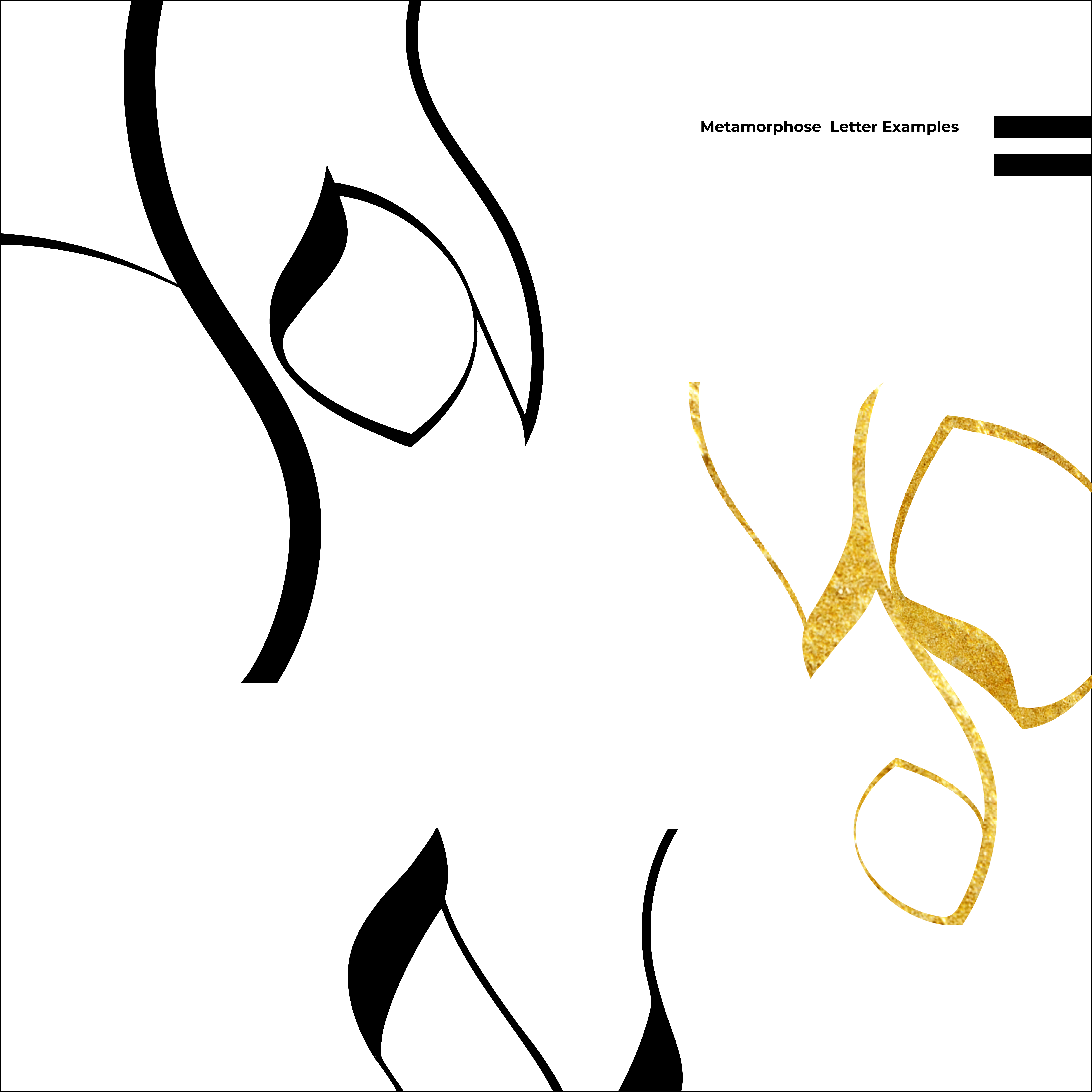
The curvy and organic nature of the letters gives them dream-like effects, and mimics Dali’s double imagery. An interesting dialogue
is created between the actual letters and
the unusual images they resemble, when
the letters are placed next to each other.

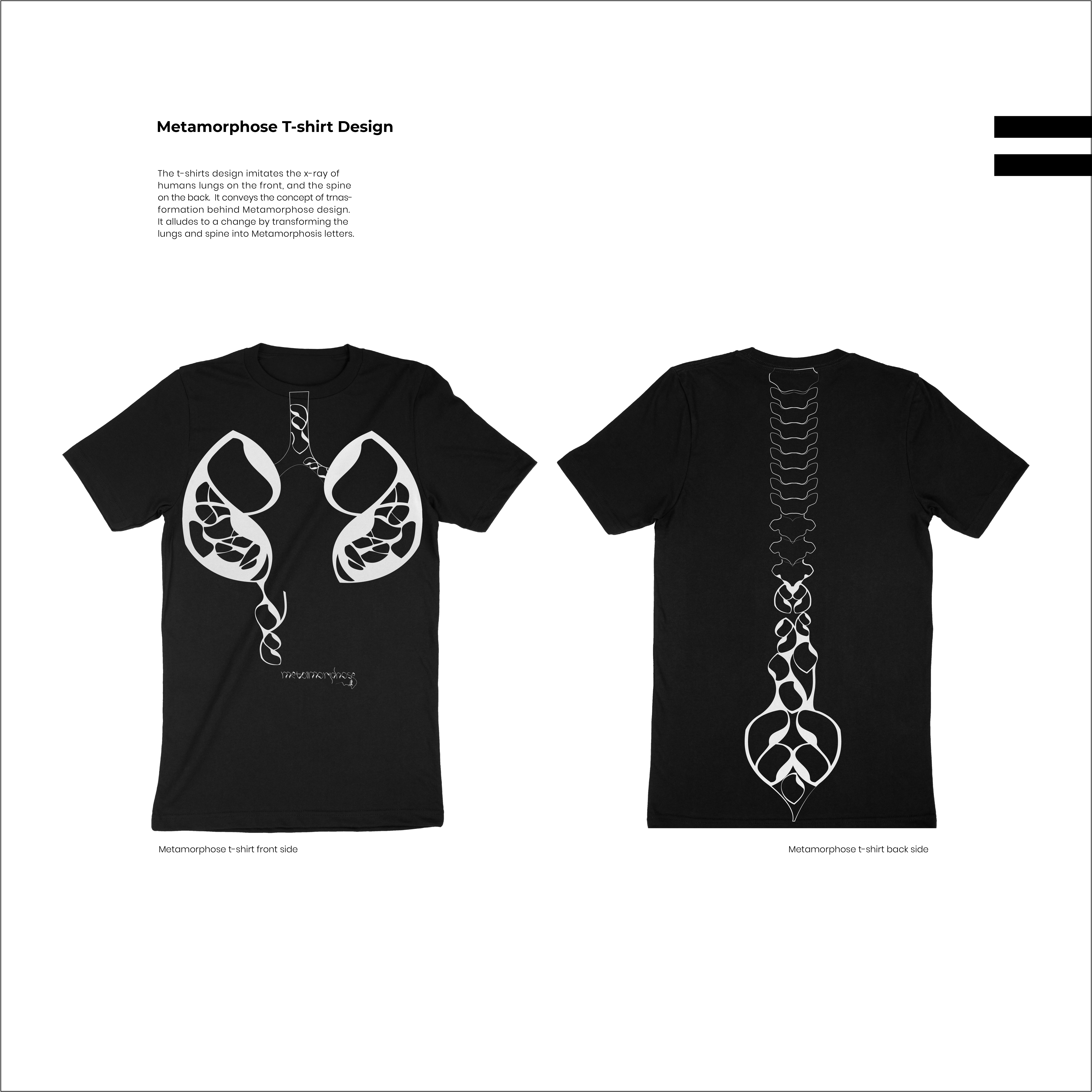

The first spread from Metamorphose typeface book demonstrates Dali’s art works. The letter L is integrated into Salvador Dali’s artwork as tree branches.
The second spread shows the anatomy of six uppercase letters.
Programs used: Adobe
After Effect, Adobe Illustrator
Memento
This is the title sequence of Memento. A 2001 movie directed by Christopher Nolan.
For this title sequence, I was inspired by Saul
Bass cut-out design style. I aimed to capture
the essence of the movie by depicting the
main character’s photos that get dispersed
by a pair of black hands to symbolize the
attack that lead to the main character’s
memory loss. I mainly use polaroid pictures,
and character’s torso with movie credits
on it as tattoos, to convey the story.
As they
both are the ways that the main character
retain the information. I also use opacity
with randomizer effect on type that appears
on the bottom of the polaroid frames to
allude to the character’s memory loss. By combining the photographs, images and
type, I aimed to make a solid and cohesive
title sequence that creatively capture the essence of the movie without revealing too
much about it.
Program used: Adobe illustrator,
Adobe Photoshop
Alvin Lustig
I designed a memorial panel and four stamps
for Alvin Lustig, who was a renowned American
book designer, graphic designer and typeface
designer of the 1940s.
designer of the 1940s.
The stamps and panel capture Alvin Lustig’s modern style
with simplified shapes and flat colors.

Alvin Lustig Stamps

Alvin Lustig Panel
The
panel design is inspired by Lustig’s book cover
design called, the man who died. The black
figure alludes to Alvin Lustig’s final movements.
The green shapes with white line patterns
symbolize his soul.
As it lives his body, he is
immortalized in his work, symbolized as four
stamps in the panel.The writing in braille alludes to Alvin lustig’s
fading vision. Even though he became blind
in his final years, he never stopped working
as a designer.
Program used: Fusion 360,
Adobe illustrator,
Adobe Photoshop
Dejabrew
Dejabrew is a unique blend of cold brewed coffee extract, and natural fruit juice that is infused with anti-oxidant using coffee fruit. Dejabrew comes in three different flavors of blueberries, mango, and grapes,
all mixed with lemon offering a plethora
of health benefits, and complimenting
the coffee quite well.
Dejabrew package follows the form of its
logo. It’s organic and fluid from alludes to
the organic and natural quality of Dejabrew.
As a whole, it represents an abstract coffee
fruit that is cut in half, revealing the coffee
bean inside. However, the two half circles
have double meaning. On one hand they
allude to the coffee bean, on the other hand, together, with their green colors, allude
to a cut lemon.
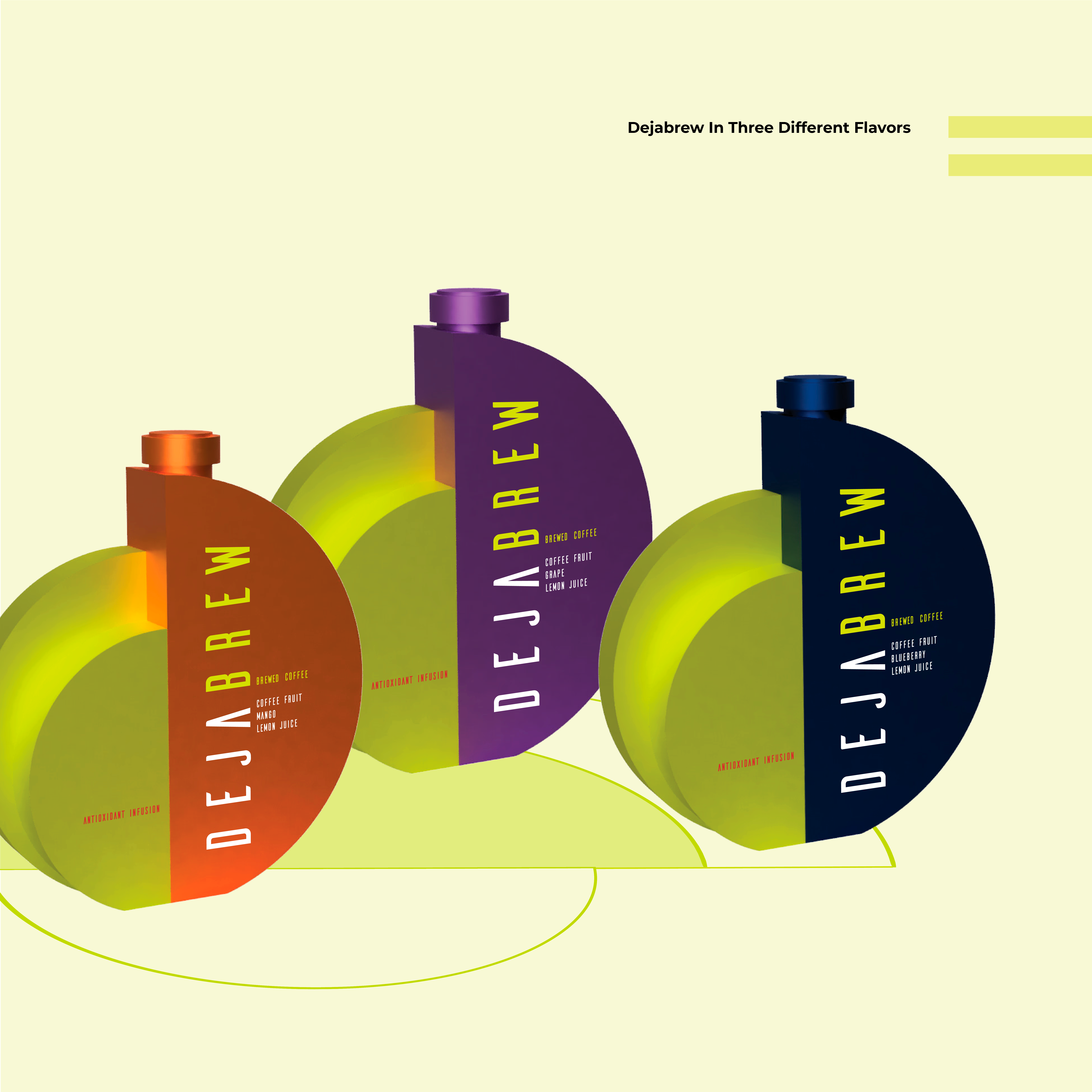
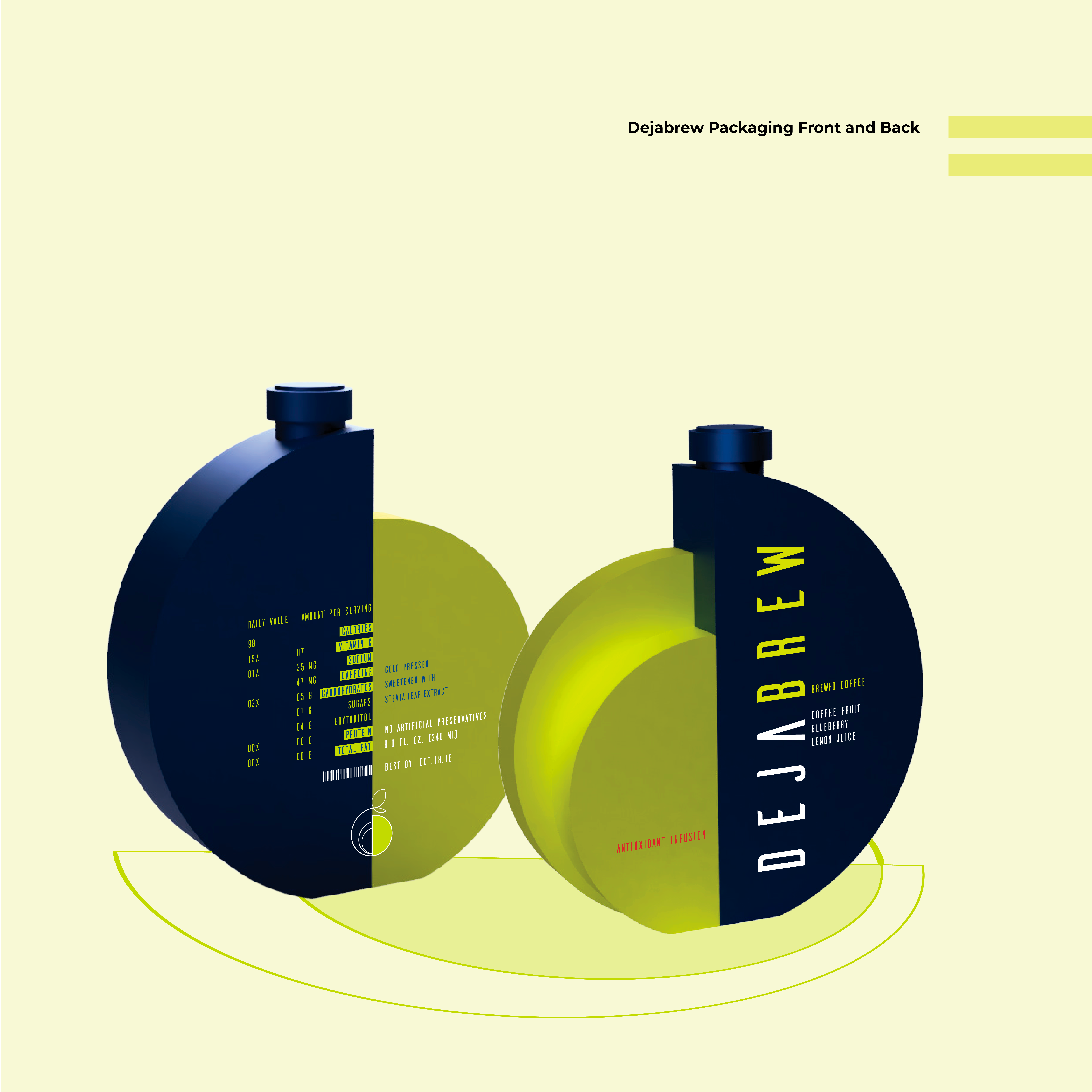
Dejabrew Package and Logo Design


Dejabrew Promotional Items
The promotional item consists of three set
of two frosted glass candle coffee cups that
come with coasters. Each set of the coffee
cups come in three different colors of green-
orange, green-blue, and green-purple that
represents the fruits in each Dejabrew drinks.
The fruit scented candle inside the cup also corresponds to The same fruit color of the
cup. As candles can be used for variety of purposes
such as celebrations, romance, and spiritual
to light up dinner table, or just to relax, they
make an ideal gift for majority of people.