Program used: Adobe illustrator,
Adobe Photoshop
Print Design: DPT
This three-panel brochure was designed for Diesel Power Technology Inc., a full-service diesel engine repair facility. The front cover features one of their most in-demand engines—commonly requested by clients—highlighted in red and blue to evoke both power and reliability. The design incorporates a dynamic pattern of slanted rectangular bars, varying in size to suggest speed, performance, and mechanical efficiency. A light blue accent was used for visual coherence and balance, supporting the content without overpowering it. The background colors and imagery seamlessly wrap around to the back panel when the brochure is folded, creating a unified and professional visual experience.


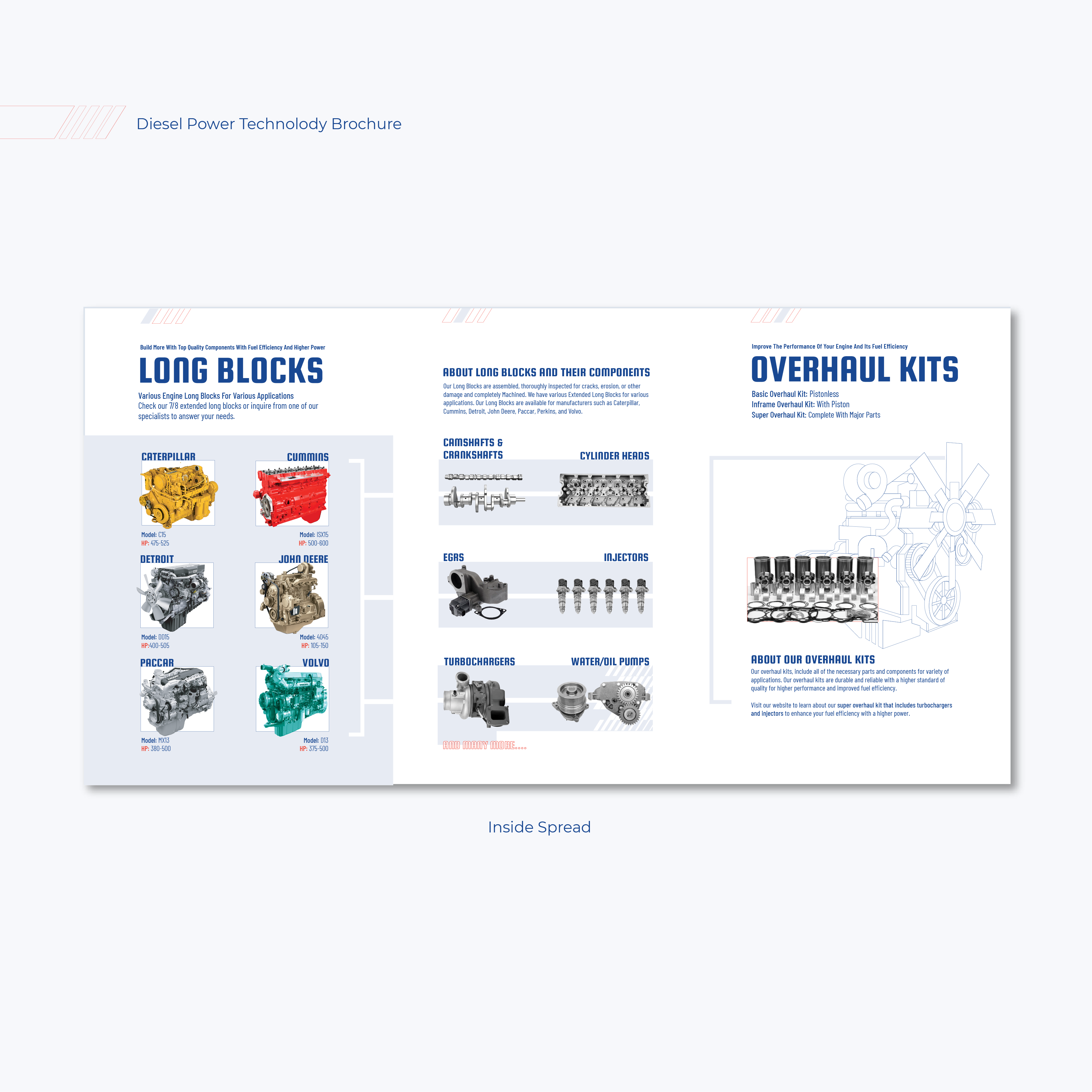
The inside of the brochure is divided into three clear sections: the first introduces Diesel Power Technology Inc.’s long blocks tailored for various applications, the second details the components included and additional services offered, and the third focuses on available overhaul kits. Throughout the interior, a very light blue is used—both as a solid background and in modular rectangular blocks—to create a strong visual connection between related products while maintaining a clean and unified layout. Carefully placed white space and subtle white divider lines help guide the reader’s eye across the content, ensuring clarity and flow without overwhelming the viewer. This layout strikes a balance between technical precision and visual coherence, supporting the information with structure and intent
.
Brochures and Business Cards
Program used: Adobe illustrator,
Adobe Photoshop
Print Design: Business Cards
Diesel Power Technology
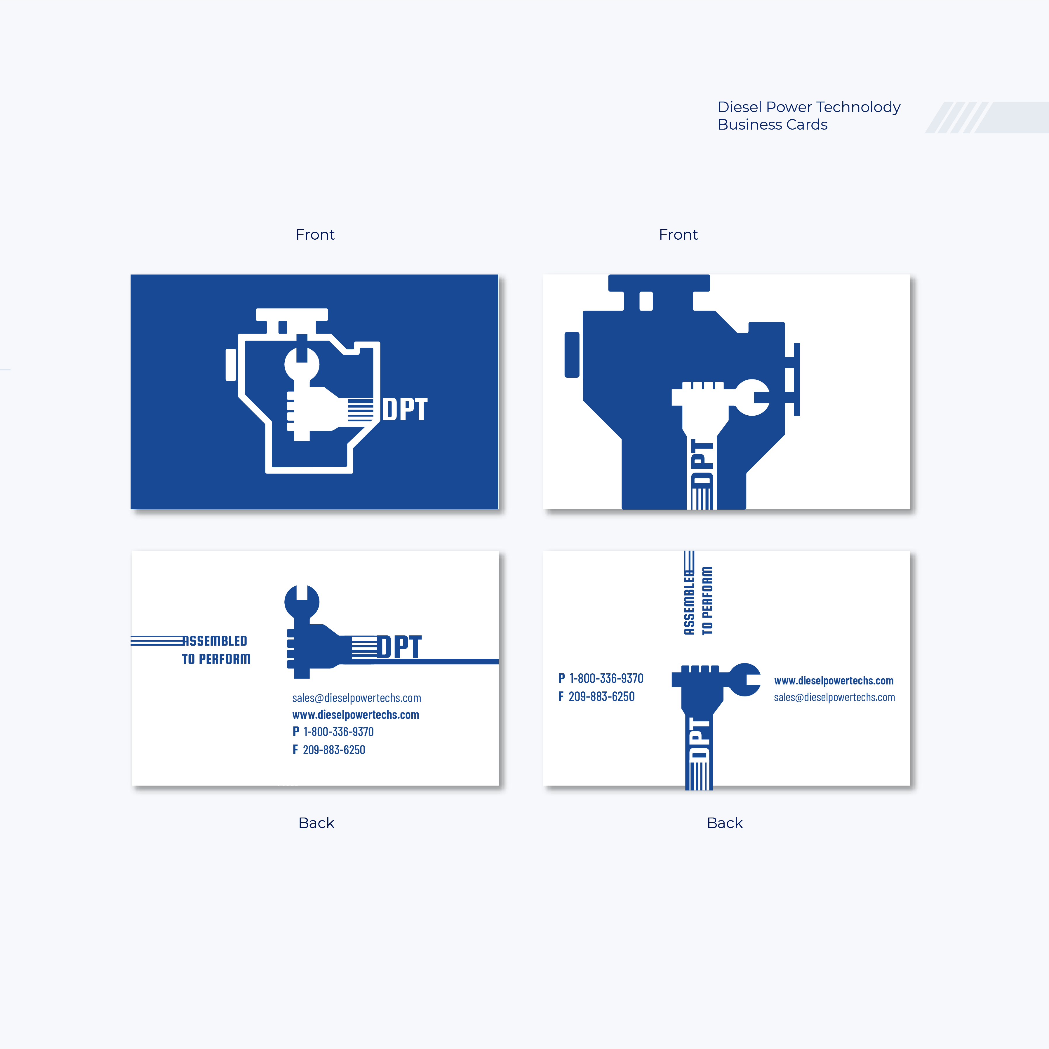
The logo designs for Diesel Power Technology were developed to visually reflect the company's strength, precision, and reliability. The front of the business card features two distinct interpretations of a diesel engine — one as a detailed solid silhouette and the other as a simplified outline — offering visual variety while maintaining brand consistency. Inside, a hand gripping a wrench is illustrated mid-repair, with clever use of negative space revealing the mechanical part being serviced. The arm is stylized with horizontal lines of varying thickness to suggest motion, speed, and mechanical rhythm, while clean rectangular elements reinforce a sense of structure, professionalism, and dependability. A bold blue color palette ties the composition together, symbolizing intelligence and trust. This same visual language extends to the back of the card, creating a cohesive and purpose-driven identity.
The logo designs for Diesel Power Technology were developed to visually reflect the company's strength, precision, and reliability. The front of the business card features two distinct interpretations of a diesel engine — one as a detailed solid silhouette and the other as a simplified outline — offering visual variety while maintaining brand consistency. Inside, a hand gripping a wrench is illustrated mid-repair, with clever use of negative space revealing the mechanical part being serviced. The arm is stylized with horizontal lines of varying thickness to suggest motion, speed, and mechanical rhythm, while clean rectangular elements reinforce a sense of structure, professionalism, and dependability. A bold blue color palette ties the composition together, symbolizing intelligence and trust. This same visual language extends to the back of the card, creating a cohesive and purpose-driven identity.
Sadaf Dental Clinic
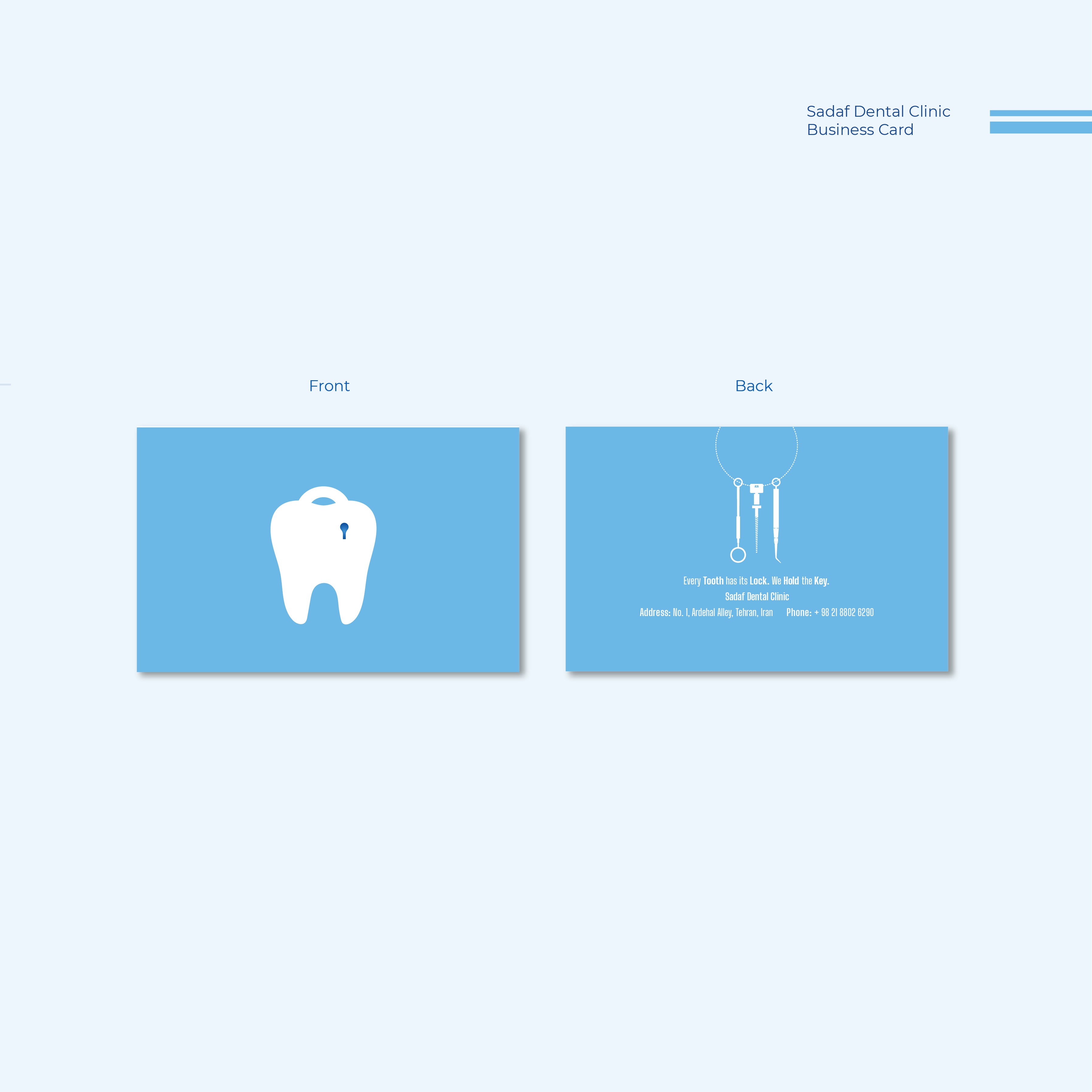
The business card design for Sadaf Dental Clinic was created to communicate a concept that’s both meaningful and thoughtfully symbolic. The front features a tooth illustrated as a lock, with a small decay-shaped keyhole embedded in its surface — a subtle but meaningful representation that ties directly into the tagline: "Every tooth has its lock. We hold the key." The imagery delivers a dual message: the challenge (dental problems) and the solution (expert care), captured in a single, minimal composition. On the back, the idea is extended through a keychain motif, where several dental tools hang as keys — reinforcing the clinic’s role in unlocking oral health solutions. A palette of white and soft blue evokes cleanliness, calmness, and clinical trust, while also enhancing clarity and visual professionalism throughout the design.
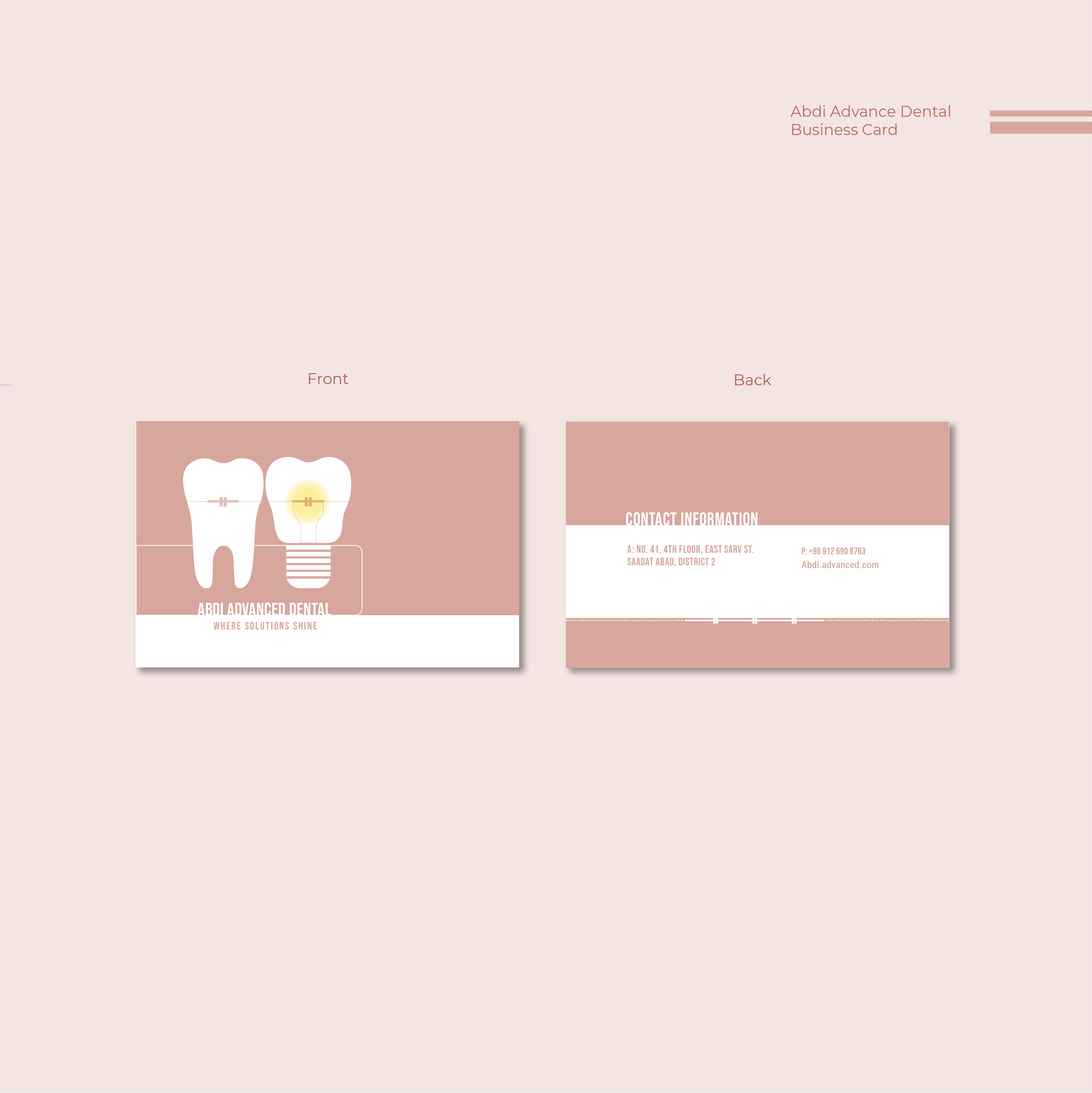
Abdi Advanced Dental
The business card for Abdi Advanced Dental brings together the clinic’s dual focus on dental implants and orthodontics through a smart and symbolic design. One tooth is illustrated with its root shaped like a metal screw, subtly referencing implant procedures while also forming the base of a light bulb — a visual metaphor for innovation and the clinic’s tagline: “Where solutions shine.” Inside the bulb, the delicate filament wires have been reimagined as orthodontic braces, integrating both vertical support wires and a central archwire. A second tooth placed beside it also wears matching braces, reinforcing the message of orthodontic care and balance.
The back of the card maintains visual continuity with a soft dusty rose background — a warm neutral reminiscent of healthy gum tissue, lending a sense of warmth, approachability, and care without overpowering the clean design. The white teeth stand in contrast to this background, symbolizing health, clarity, and professionalism. At the base of the card, a minimalist brace wire graphic runs horizontally, grounding the layout while subtly reinforcing the orthodontic theme. This layered visual storytelling ensures the card is not just a contact tool, but a reflection of the practice’s precision, expertise, and thoughtful care.