Program used: Adobe illustrator,
Adobe Photoshop
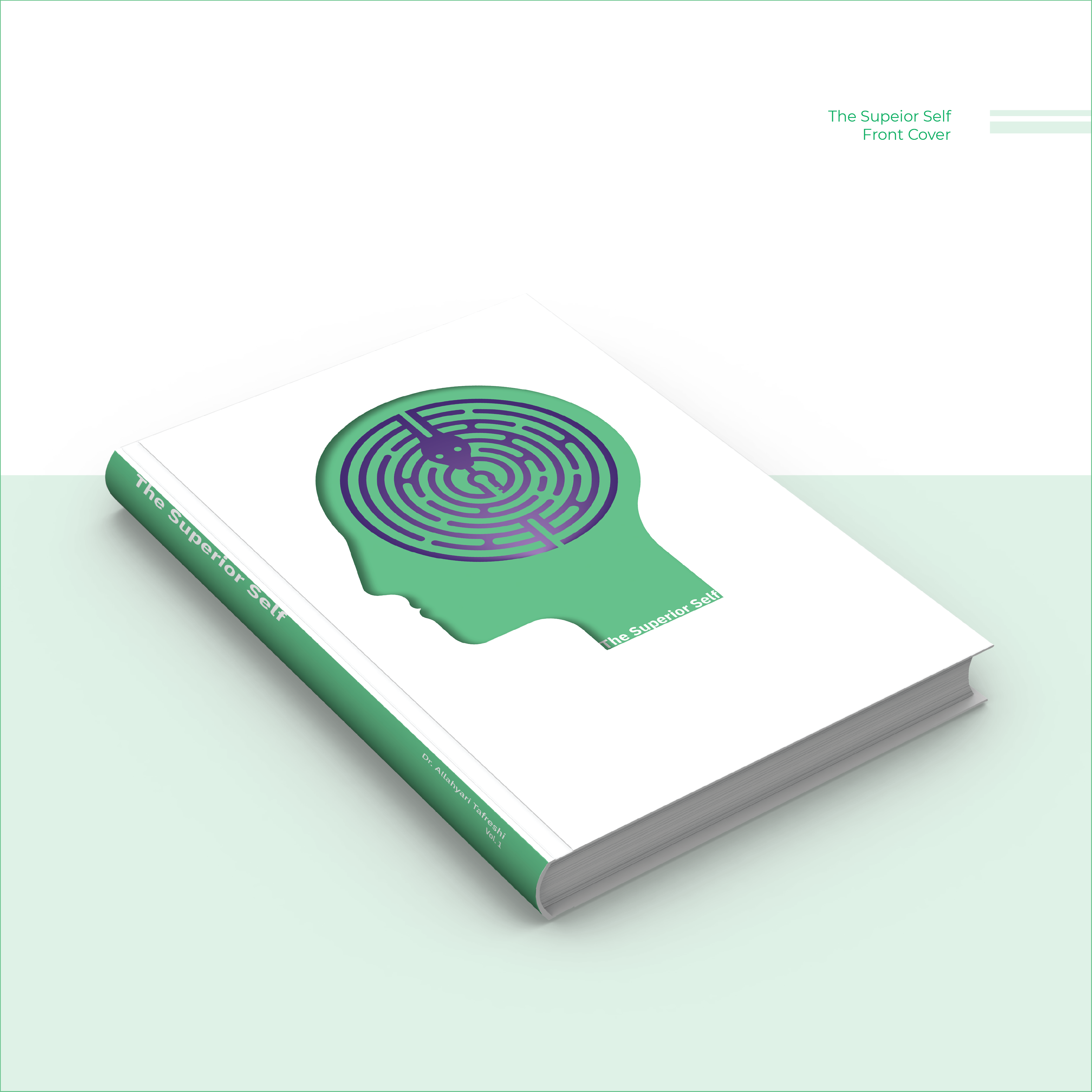
The Superior Self
A Book Cover Design Inpired by the Psycho-Hermeneutic Approach
While I was in Iran, I had the privilege of attending classes on Psycho-Hermeneutics under Dr. Saman Allahyari Tafreshi, the founder of this psychological-philosophical approach. Psycho-Hermeneutics explores how we interpret our inner world—how unconscious narratives, symbols, and buried emotional mechanisms shape the way we perceive reality, ourselves, and others. After reading the book and engaging with the material, I was deeply struck by how clearly these hidden patterns were brought to light. This design was born from that experience.
Hover over each image and use the arrows to view all the slides
Symbolism and Structural Concepts
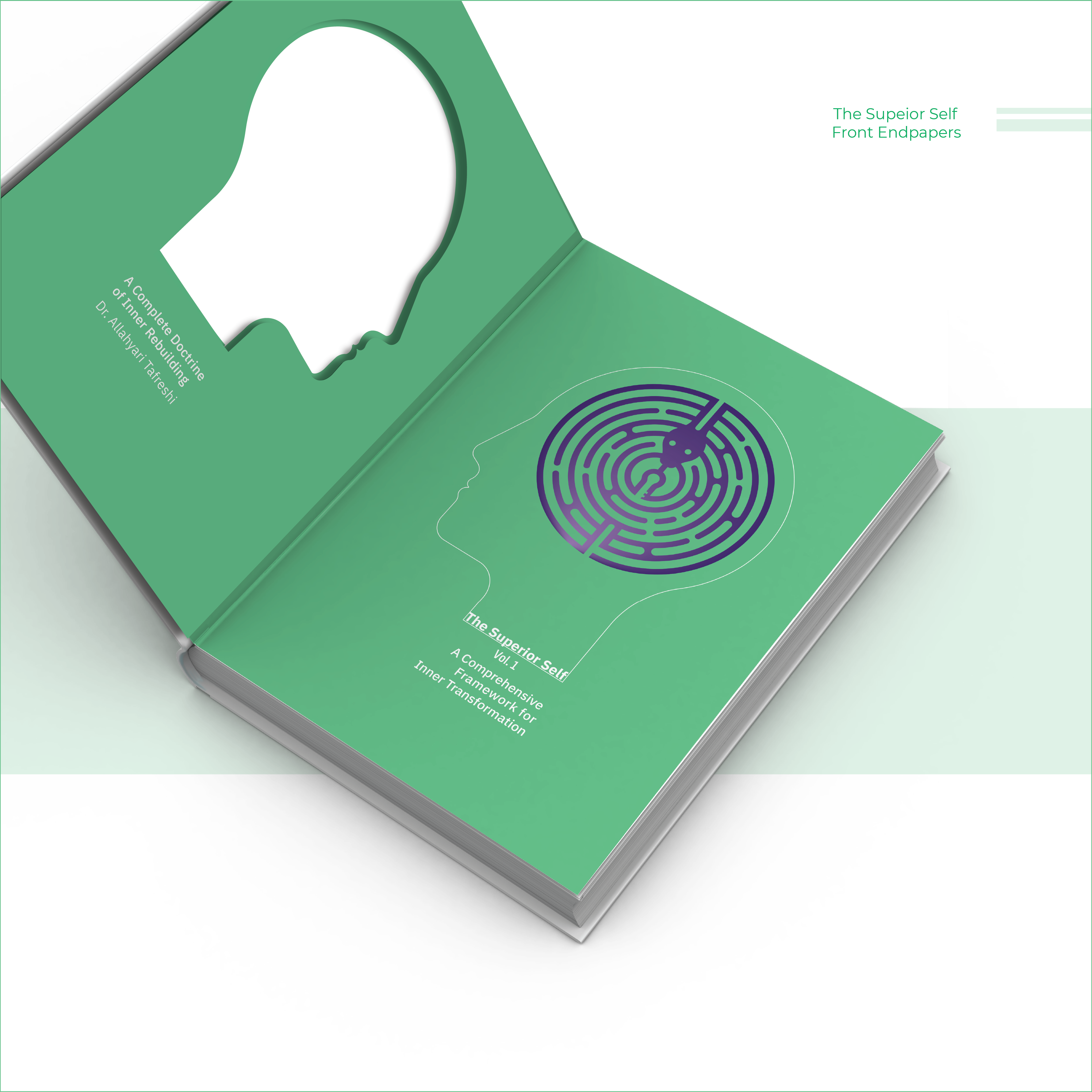
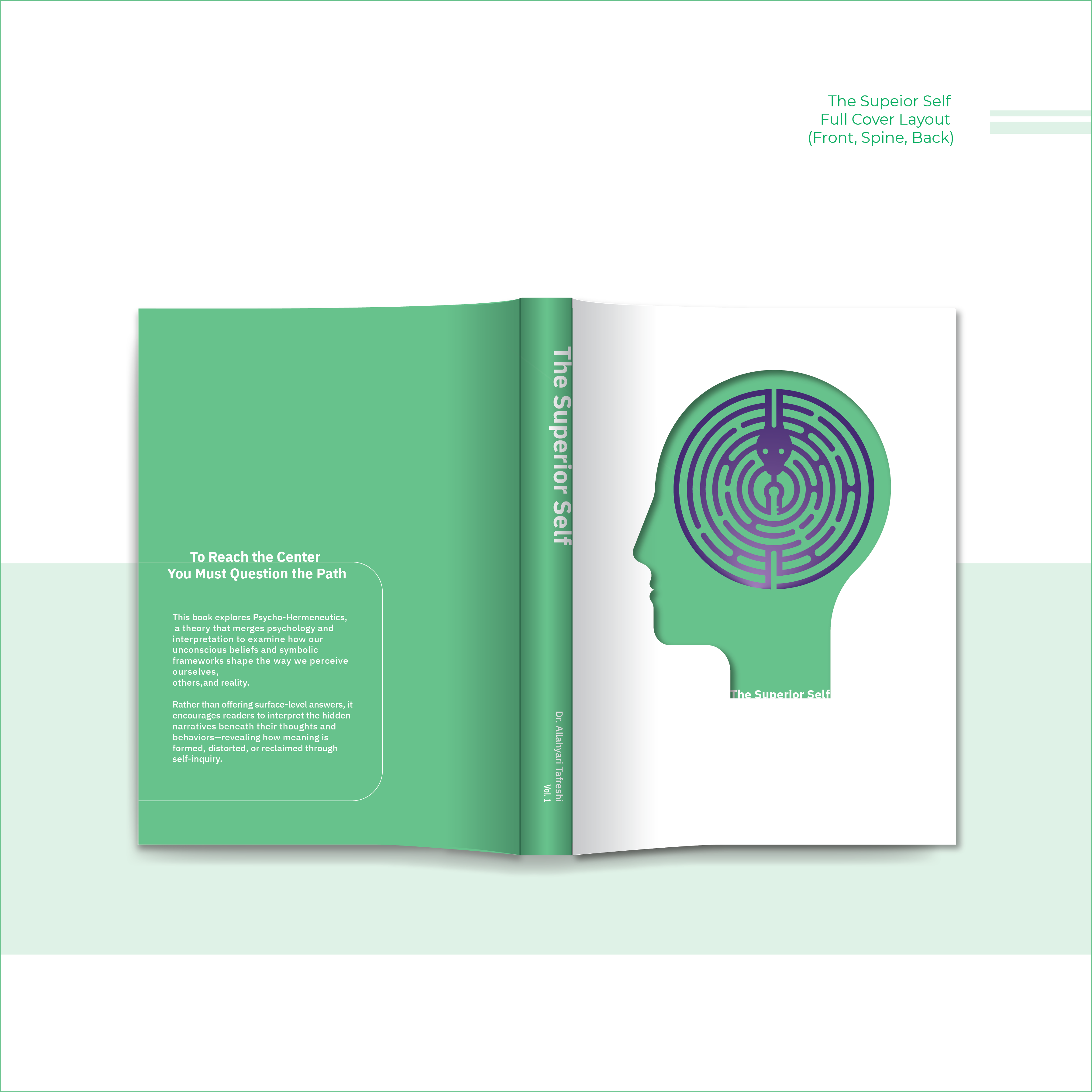
The front cover features a die-cut silhouette of a human profile, offering a glimpse of the green front flyleaf beneath. When the book is opened, the front endpapers reveal two facing profiles—one hollow, one complete with the labyrinth. This visual pairing symbolizes the interpretive nature of the self: how we’re constantly encountering mirrored versions of our identity, shaped by unconscious beliefs and inner narratives. In the context of Psycho-Hermeneutics, these facing forms suggest that self-understanding emerges not in isolation, but through the tension between perception and reflection—between what we think we are and what lies just beneath.


Understanding the Labyrinth: Design and Interpretation
The labyrinth, shaped like a brain, reflects the complexity of the human psyche. Woven into it is a snake—symbolizing both wisdom and deception. In one sense, it represents self-knowledge and growth; in another, it stands for the inner mantras we mistake for truth. A belief like “If I stay prepared for the worst, I won’t get hurt” can feel like self-protection, but it keeps us stuck in fear and vigilance.
At the center lies a key, symbolizing the possibility of change. But reaching it requires more than direction—it demands interpretation. In the design, the key is concealed within the
form of the snake’s tongue—its split shape subtly outlining the key itself.
This reflects a core idea in Psycho-Hermeneutics: the tools for transformation are often hidden within the very things that confuse or challenge us. Only by engaging with them consciously can we find a way through.
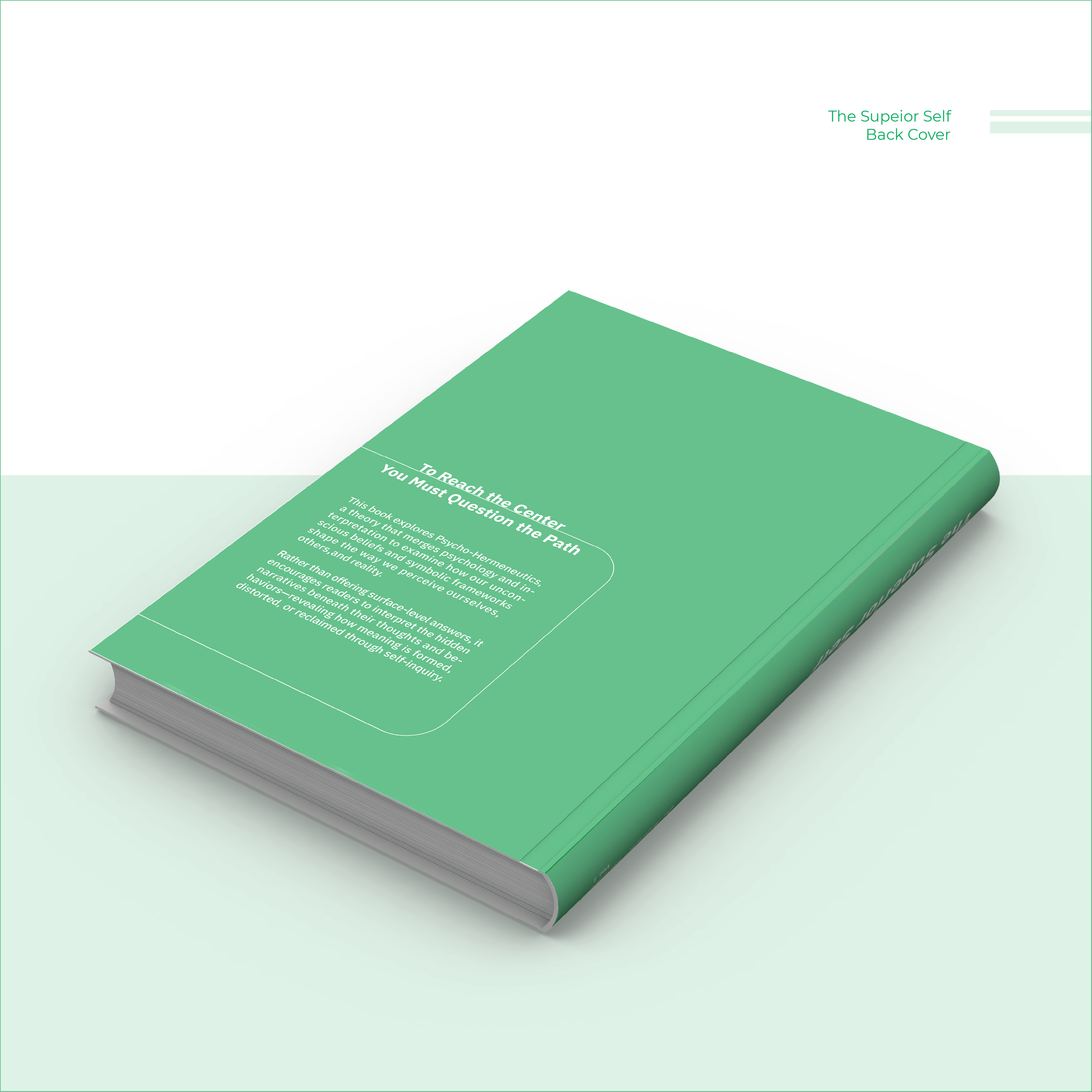
In the end, it’s not the symbol itself that holds power, but how we engage with it. The path, the serpent, the key—all mirror the mind’s hidden architecture. Psycho-Hermeneutics asks us to look again, to interpret the familiar with new eyes, and to decide whether we remain inside the loop—or find a way through.


Symbolism Through Color
I used purple for the labyrinth and symbolic structure because it represents depth, introspection, and the complexity of the unconscious mind—the exact terrain Psycho-Hermeneutics explores. It’s a color long associated with transformation and hidden knowledge.
The green background was chosen deliberately to create a subtle tension. Green, while often seen as calm or natural, also carries associations with familiarity, illusion, and the comfort of old patterns—the kind we often mistake for truth. It contrasts with the purple to reflect the psychological tension between staying in what's familiar versus confronting what lies deeper.
Together, the colors reflect the core duality of the concept:
The pull between what protects you and what transforms you.
